New Feature: Slicers
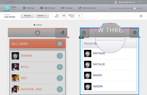
Today we’ve released Slicers — a way to create fixed headers and footer in your Flinto prototypes. Slicers work great for title bars, tab bars, toolbars, keyboards and anything else that needs to be fixed to the top or bottom of a screen. By dragging a slicer into place just below or above a fixed header or footer area, you give Flinto all the information it needs to display your screens with scrollable content and fixed areas.
Try a sample prototype that uses Slicers. Visit this link on your iPhone.
The Slicer UI

Flinto works with the type of screen mockups that iOS designers tend to produce as part of their normal workflow. This is what makes Flinto a great addition to your existing workflow, instead of reinventing your workflow.
It was important to us that slicers worked this way too. Since almost all fixed areas on iOS screens are headers or footers, we realized that we could just slice those parts off, and then fix them in place on top of the other content which would scroll underneath.
The only input needed is the position of the slicer and of course we went to great lengths to make that task as easy as it can possibly be.
Edge Detection

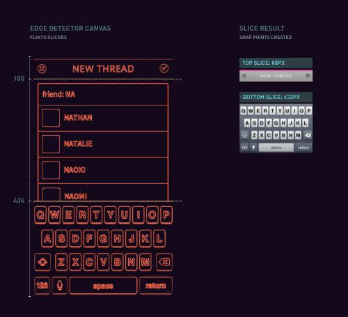
Slicers use Flinto’s sophisticated edge-detection system that automatically detects 90% of title bars, tab bars, tool bars and keyboards on your screens. Just drag the slicer down, or double click, and it will snap right into position — it really could not be easier.
Slice Several Screens
Select multiple screens with matching fixed areas, and slice them all at once. Use command + a to select all screens, or shift + click to select a subset of all your screens.
Magnifier and Fine-Grained Adjustment
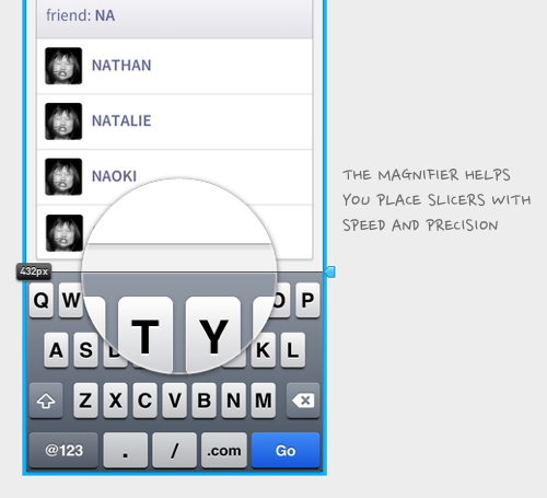
In cases where your header or footer isn’t auto detected, you can use the magnifier to get pixel-perfect placement. Drag a slicer into the correct area, then use the arrow keys to move it into exact position. Use shift+arrow to move in 10px increments.

Building The Viewer
Avoiding the Uncanny Valley of Scrolling
You’ll notice the scrolling on Flinto prototypes is super smooth. We went to great lengths to use the iPhone’s built-in inertial scrolling instead of choppy and inaccurate simulated scrolling. We’ve seen far too many prototypes and web apps that use simulated scrolling that places them squarely inside the uncanny valley.
Color Continuation
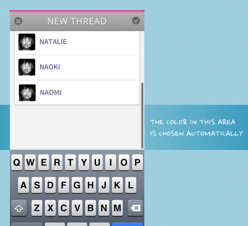
When you introduce interial scrolling, it becomes possible to scroll past the top and bottom of a screen. So, what shows up in this area? It would be an easy enough problem to ignore. Just leave it as solid white, that should be good right? That’s not our style! We analyze the top and bottom row of pixels and pick a color to use which makes this transition much less abrupt.

Try it and Tell Us
Slicers are live now. Give it a try! If you haven’t signed up for Flinto yet, now’s a great time to start your 30 day free trial. We love hearing from you, so please get in touch and let us know what you think. Make sure to follow us on Twitter too.