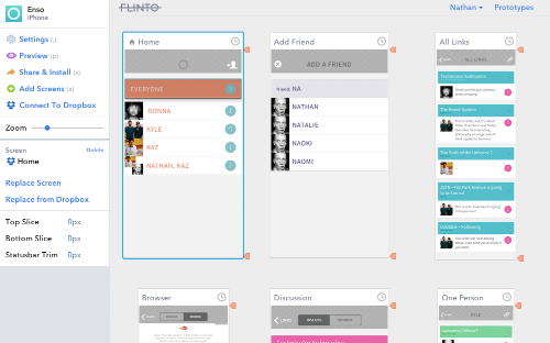
New Editor UI

The Flinto editor has been updated with a redesigned control panel. We’ve moved the top bar to the side. It looks nicer, is easier to access (especially when scrolled down) and best of all, it’s much more flexible for new things we may add in the future.
It can be jarring when a tool you use frequently is suddenly re-organized, so we don’t do it lightly. This is a critical change because it gives us the flexibility to add features without running out of space. The first such feature is Dropbox sync, which we also launched today.
Update: The dropbox sync feature will be disabled as of June 28, 2007
The new control panel also includes a convenient numeric input that allows you to adjust values by dragging up and down in addition to using arrow keys.