My Excruciating Trip to Etsy

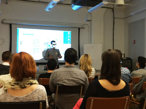
I was recently invited to give a “Designer Guest Hour” talk at Etsy’s headquarters in Brooklyn, New York. I was honored and excited to have been invited out. I woke up in New York on the day of my talk at 6:30am with a sore throat and a swollen eye. I went to a doctor just before the talk and was given Benadryl among other things. I ended up being sick, uncomfortable and really drowsy during my talk!
Fortunately, everyone at Etsy was very understanding and the talk ended up going really well. I was met by Magera and Jay, who were amazingly hospitable. They showed me and my fiancé all around the fabulous Etsy office.

During my presentation, I talked a bit about how Flinto got started, and showed a demo. Turns out several Etsy employees were already active Flinto users. I gave them some power-user tips before turning my attention to my design Philosophy with Flinto.

I shared one of my favorite design tips. When designing something, consider “How would it work if it were magic” and then work backwards from that until you come to a solution that's possible to build (more on this philosophy here.) I showed how this thinking was applied to our Slicers feature. I went over Slicers in detail, describing seven challenges we solved in building the feature.
-
Truly Fixed
The fixed headers and footers created with slicers need to be really fixed in place, they can’t pull down with the page. This is surprisingly difficult to do with Web technologies on iOS.
-
Transparency
The fixed ares need to support transparency in order to simulate floating buttons and mimic the iOS 7 style translucent effects.
-
Precise Placement
It needs to be possible to position the slicers precisely, being off by one pixel in either direction ruins the effect.
-
Transitions
The fixed areas should transition in a manner similar to the actual iOS transitions when both screens have fixed areas of the same height.
-
The Odd Pixel Problem
When a slicer is placed at an odd number of pixels from the top or bottom of the screen, it creates a situation where it would need to have a height with a half-pixel in it when viewed on-device on a retina display. We spent a ton of time fixing this issue in a way that our customers never see.
-
Color Continuation
With elastic scrolling in iOS, it’s possible to scroll beyond the top or bottom of a screen. Instead of showing some generic shade of gray, we continue the most common color of the row of pixels next to the slicer. This is such a nice effect, and it’s easy to forget that it’s even happening!
-
Snapping
Using our LinkSnap technology, we automatically detect the slicer point for many screens. This means you can select all your screens, and drag the slicer into the pre-determined snap point and be done setting all of your slicers in just a couple of seconds!
We solved each of these problems in the best way we could. Doing things this way required a lot of extra work and time, but that’s the only way to achieve magical results.
Slicers are a feature I’m really proud of. It’s the first thing I’ve ever designed that’s been copied by other companies. Being copied give me a feeling of validation, and a motivation to be all the more ambitious with our next set of features.
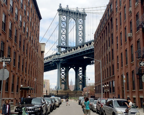
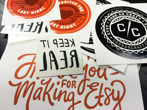
Before my fiancé and I left, Jay and Magera took us to lunch at the nearby Number 7 Sub shop where we chatted and enjoyed the view. And they didn’t send us home empty handed. Thanks for having us, and thanks for the stickers, Magera, Jay and Etsy crew!
