Flinto Try Flinto Mobile prototyping
  • Blog Home
  • Flinto Home
    14 October 2013

    Status Bar Status

    Update: We’ve found a workaround for black transparent status bars. This option is now available in your prototype settings under the “Share View” tab.

    Two commonly asked questions about status bars in Flinto prototypes are, “Can I remove the status bar entirely?” and “Can I use a black transparent status bar?”

    Flinto prototypes are delivered as standalone web apps. Standalone web apps are simply websites that can be installed onto the home screen of your iPhone or iPad. Browser chrome such as the title bar, and toolbar, are removed. These apps can have their own custom icon on the home screen which makes them appear just like real apps. Perfect for prototypes.

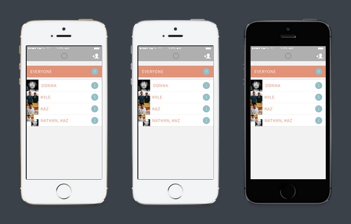
    One of the biggest visual differences between these standalone web apps and native apps is the status bar. Apple’s iOS does not provide a way for standalone web apps to hide the system status bar.

    In iOS 7, a fully transparent status bar that is laid over the screen content has become standard. However, Apple provides no way for standalone apps to specify a transparent status bar with black text, only white.

    We’re super frustrated by this because we’d like to provide these option to our customers. We started building a native app for viewing Flinto prototypes. That way we could have total control over the status bar. But that route has problems too. Namely, it complicates Flinto’s elegant share and install process.

    We’ve started to regain hope that Apple would improve the status bar settings for standalone web apps. This is largely because there are many other bugs in Mobile Safari in iOS 7. Some of them are clearly problems that need to be fixed. Most of those problems are listed out in this fantastic blog post by Maximiliano Firtman. We’re assuming Apple ran out of time to fix these issues and will need to circle back to fix them in a future iOS 7 update.

    So, we’ve filed bugs, explained our problem, and now we’re waiting. If the status bar issues aren’t fixed in a reasonable timeframe, we’ll reconsider the native app solution.

    If you’d like to add a bug for Apple to consider, you can do so at Apple’s Bug Reporter.

    • Try Flinto
    • Share this on Twitter
    • Join our Facebook Group
    08 October 2013

    Prototype Even Faster with Link Groups

    What do you do when you are prototyping an app that has a tab bar with five buttons? You create five links. Then you create five more links on the next screen. And five more, and five more. What do you do when you need to change one of those links? You have to go back and change it on all those screens!

    We’ve solved this annoyance with our latest feature, Link Groups. Using Link Groups, you can set up the links once and drag them right onto another screen. That’s it. Link Groups work in the seamless intuitive fashion we’re known for.

    Take a look at this video overview of Link Groups in action.

    Link Groups in Action

    Here’s the prototype created in the video if you’d like to try it.

    Tips and Tricks

    • Add additional links to an existing group by selecting one grouped link, and the link to be added and pressing ‘g’ or the ‘Add to Group’ button.
    • Ungroup links by selecting all of them and pressing ‘u’ or clicking the ‘Ungroup’ button. This breaks apart the group on one screen.
    • With one link in a group selected, pressing ‘g’ or the ‘Select Group’ button will expand your selection to the whole group.

    We hope this makes your prototyping process even more pleasant. Let us know how it goes.

    • Try Flinto
    • Share this on Twitter
    • Join our Facebook Group
    25 September 2013

    New Share Page with iPhone 5s and Color Options

    New Device Frame Colors

    We’ve just put up a new share page with the option to change device colors. Now you can preview your app in a beautiful, realistic iPhone 5s or iPad mini, in any of the available colors. You can set a default device frame color in your prototype’s settings under “Share View.” Many thanks to Louie Mantia for providing beautiful recreations of the iPhone 5s.

    The new share page also has a new collapsible sidebar. Enjoy a completely uncluttered view of your prototype. You may notice that there’s a bit of extra space in that sidebar. Could there be more new features coming to the share page? Perhaps!

    You’ll also notice some other changes around the site. We’ve made a slight update to the overall style, added new iOS 7 style default icons and made iOS 7 mode the default.

    • Try Flinto
    • Share this on Twitter
    • Join our Facebook Group
    29 August 2013 by Nathan Manousos

    Don't Just Throw it Over the Fence

    The only way to create great software is to work with developers throughout the process. You can send someone to the store with a grocery list and get back precisely what you asked for. Not so with software. You can’t just throw your designs over the fence to developers and expect great results.

    Too many designers find themselves unhappy with the implementation of their designs. They complain that “the developers messed it up.” Don’t accept this. See to it that your designs are faithfully implemented.

    Why Not Throw it Over the Fence?

    • Your designs will never tell the whole story or account for every possibility.
    • Fundamental changes to your work often need to happen based on technical constraints.
    • You’ll miss out on potential for better ways of doing things that are based in technology.

    Collaborate Closely, Gesticulate Wildly

    Pasquale D’Silva told me that he uses wild gesticulations to convey the intended characteristics of animated interfaces to developers. That’s the kind of communication that can’t happen without close, ongoing collaboration between design and development.

    The iPad photos UI was created the same way. When I ran into one of its developers, I asked what the process was like. Unsurprisingly, the process involved a close collaboration between design and development. They often sat together in order to perfect the behavior of the UI.

    Discipline Yourself Into This Mindset

    Decide that your portfolio will only have finished, working software. Not mockups or prototypes. This way you’ll be forced to do whatever it takes to reach the intended end result. Feel empowered to see to it that great results are achieved. Don’t be content to throw designs over the fence. Open the gate and work together from beginning to end.

    • Try Flinto
    • Share this on Twitter
    • Join our Facebook Group
    19 August 2013

    Save 20% With Yearly Billing

    We’ve just added an option to pay for Flinto by the year. By paying yearly, you’ll receive a 20% discount off of the amount you would have paid with monthly billing. The same discount applies to individuals and teams.

    To enable yearly billing, just go to your billing page and click the button!

    Enable Yearly Billing

    • Try Flinto
    • Share this on Twitter
    • Join our Facebook Group
    15 August 2013

    iOS 7 Transitions and Status Bars

    Previously we added iOS 7 icon support to IconStrike and to Flinto prototypes. Today we are announcing support for iOS 7 style status bars and transitions.

    Translucent Status Bars

    iOS 7 makes heavy use of a translucent status bar that helps the UI of your app merge seamlessly with its content. Flinto now supports this in white.

    iOS 7 Status Bars
    New status bar options. Black is coming soon, we hope!

    The black status bar doesn’t work due to bugs in the iOS 7 beta. We’ve filed a report with Apple and are hoping that this will be fixed soon. We’ll add the option right away when it is.

    New Push Transition

    We meticulously recreated the new iOS 7 push transition; it looks perfect! It will be used automatically when you view your prototype on an iOS 7 device. Look for a future blog post about our techniques for accurately recreating the transition.

    iOS 7 Transitions
    Native transition is on the left, our recreation is on the right.

    Enable iOS 7 Mode in the Web viewer

    The new status bars and transitions appear on iOS 7 devices only, however you can force them to appear in Flinto’s Web preview of your prototype by enabling “iOS 7 Mode” in your prototype’s settings.

    • Try Flinto
    • Share this on Twitter
    • Join our Facebook Group
    09 August 2013

    Offline Support for Flinto Prototypes

    Flinto customers love impressing clients and investors with their realistic prototypes, but there is always the looming worry that a reliable network connection may not be available. Today, we’re proud to release offline support for Flinto prototypes! It works automatically. Here’s how:

    • Open your prototype: Your prototype will be downloaded in the background while you use it on-device.
    • Go offline: While offline, the prototype will work normally. Try it using airplane mode.
    • Back online: Next time you open your prototype while online, any updates will be stored for later offline use.


    Offline Information in Menu

    You can confirm that your prototype is stored offline by tapping and holding on any screen, you’ll see a menu with a line of text indicating that the prototype has been downloaded, or that a download is in progress.

    Next time you give a presentation, try incorporating your Flinto prototype, it’s sure to impress. Let us know how it goes!

    • Try Flinto
    • Share this on Twitter
    • Join our Facebook Group
    03 July 2013 by Nathan Manousos

    What Douglas Engelbart Taught Me About Designing User Interfaces

    I attended a small dinner party in 2005 when I was a student at Santa Clara University. Our special guest was Douglas Engelbart, inventor of the computer mouse. Englebart died Wednesday.

    I asked Engelbart what he thought of Apple's first two-button mouse. Apple had just introduced its Mighty Mouse, which had four functional "buttons": left and right capacitive sensors, a track ball with a pressure sensor and side squeeze sensors. Apple had steadfastly sold a one-button mouse for years.

    Engelbart answered that he would like to see a mouse with even more buttons.

    Defending a multi-button mouse, Englebart explained to the group that immediate learnability should not always be the goal of a hardware device or a software interface. In many circumstances an effective interface may be complicated and challenging to learn. Englebart offered the keyboard as an example of a complicated input device. It takes considerable time and effort to learn touch-typing, he said, but once mastered, you’ll enjoy a lifetime of fast text input.

    This was a bit of an epiphany for me. I had been such an advocate of Apple hardware and its easy-to-use interfaces, that I had blinded myself to the benefits of more advanced interfaces that may require some time to learn. I realized that some of the best interfaces I used on a daily basis were somewhat unintuitive. I’ve memorized hundreds of key commands, I’m a master of Photoshop’s intimidating menus and palettes, and today I make extensive use of Quicksilver’s many features. I’ve even found myself craving the power that comes with even more complicated interfaces such as that of VIM.

    What I’ve learned after reflecting on my experiences is that it’s important to consider your audience above all else when designing interfaces. The user's experience is the only thing that matters when it comes to interface design. Just remember who that user is, and realize that ultimately, the best interface experience may be one that requires learning.

    Your interface should also provide an easy introduction, and plenty of power when needed. The Macintosh embraces both of attributes beautifully. I try to incorporate this thinking into my product, Flinto, as well. Flinto’s interface is very visual, and is meant to be very straightforward, but shortcut keys exist for almost every common command. I hope to expand this even further in the future, giving more power to those who crave it.

    Take a moment to appreciate the contributions Engelbart made to human-computer interaction. Read his biography, and read his obituary in the New York Times. And next time you design an interface, add a few extra buttons for Mr. Engelbart.

    • Try Flinto
    • Share this on Twitter
    • Join our Facebook Group
Previous Page Next Page
  • Blog
  • Pricing
  • Icon Strike
  • About & Contact
Use of this website constitutes acceptance of our User Agreement and Privacy Policy