Flinto Try Flinto Mobile prototyping
  • Blog Home
  • Flinto Home
    02 July 2013

    Further iOS 7 Icon Support

    There’s been a lot of talk about iOS 7 icons, from the built-in app icon designs, to the exact border radius math behind those squircles. If these kinds of things excite you as much as they do us—you’re in luck. We’ve beefed up our iOS 7 icon support across Flinto prototypes and Icon Strike!

    Flinto prototypes and Icon Strikes now support the following iOS 7 icon sizes:

    • 120×120 for iPhones
    • 152×152 for Retina iPads
    • 76×76 for legacy iPads

    Flinto prototypes accept one icon image, if you upload an exact match for one of the iOS 7 sizes, it will be used. Otherwise the icon will be resized to the current iOS 6 icon sizes. Icon Strike can accept all possible icons and the correct one will be displayed on the appropriate device. Just drop ’em all into Icon Strike and it will figure it out.

    So go ahead and get your icons ready for iOS 7, and tweet us your creations!

    • Try Flinto
    • Share this on Twitter
    • Join our Facebook Group
    13 June 2013

    iOS 7 Support for Icon Strike

    iOS 7 Home Screen

    Regardless of how you feel about Jony Ive redesigning things, we just added support for iOS 7 icons to Icon Strike! If you haven't tried it already, Icon Strike is the easiest way to test iOS app icons on your home screen, and it's totally free.

    Icons for iPhone apps in iOS 7 are 120x120, slightly bigger than the 114x114 that was used previously. The corner radius has also changed slightly as shown in this Dribble shot by Brad Ellis.

    If you are working on a new icon design, check out this rendition of the official iOS 7 icon grid by Dribble user Denis Shoomov.

    iOS 7 Icon Grid

    We had to do some tricky work-arounds to support these icons because mobile safari does not yet support 120x120 icons alongside other sizes using the sizes="120x120" attribute. If this bugs you as much as it bugs us, file a bug report with Apple!

    • Try Flinto
    • Share this on Twitter
    • Join our Facebook Group
    07 June 2013

    Getting Started Just Got Easier

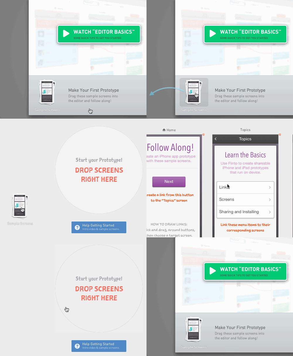
    We’ve created a new Flinto getting-started page with sample screens for those people who sign up, but never try making a prototype.

    Now when you sign up for a new account, you’ll be placed directly into the Flinto editor. You can watch the Editor Basics video to learn how the Editor works. You can also start building your own prototype with our new sample screens. Follow the instructions on each screen and you’ll have a nice sample app in no time!

    Getting Started Demo

    To make the process fun and realistic, we built a draggable icon for the sample screens. You get to drag the screens into the editor just as you would with real screens from your computer. It was fun figuring out how to make this work. Here’s a (somewhat technical) overview of how we built it:

    • We used jQuery UI Draggable’s helper option to produce a cloned sample screen icon when dragging starts.
    • If the clone is moved more than 100px, the modal window will be hidden. Since the clone exists outside the modal, it avoids being hidden along with it. When the clone is released, the sample screens are loaded in through a separate mechanism.
    • When the clone is released, it disappears instantly. We wanted the clone to fade out smoothly using Transit, so another clone is made and placed right where the first one was released. Then that clone goes through its animated transition out.

    The result is quite nice! We hope you’ll check it out. If you already have an account, just create a new iPhone prototype and click the "Help Getting Started" button.

    If you haven’t already, sign up for a 30 day free trial of Flinto, and try our new sample screens!

    • Try Flinto
    • Share this on Twitter
    • Join our Facebook Group
    05 June 2013

    Password Protected Prototypes

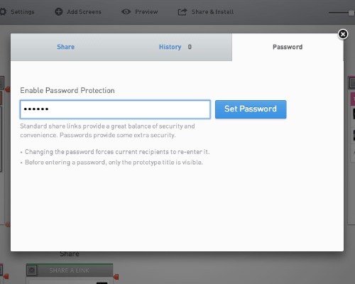
    Today we’re deploying another frequently requested feature—password protected prototypes. You now have the option of password protecting prototypes using the redesigned share panel. Anyone you share with will be required to enter the password before they can view or install the prototype.

    Password Input

    Sharing Without a Password

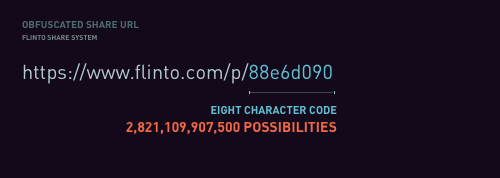
    Our existing share system strikes a great balance between security and convenience. By using obfuscated URLs, the install links generated by Flinto are quite secure. It’s very unlikely that someone who wasn’t sent a share link will figure out how to view your prototype.

    Password Combinations

    However, it is within the realm of possibility that a share link might fall into the wrong hands. When you are working on an especially sensitive project, you may want to add a password.

    Adding a Password

    A password adds an additional layer of security. Even if someone comes across the share link, they can’t access the prototype without the password. It’s a good idea to share passwords in person if possible, or at least use a different medium than the one used to share the prototype.

    Share Panel

    Anyone who you already shared your prototype with will be required to enter the password if you add one. If you change a password, the new password will need to be entered by anyone using your prototype.

    Before the password is entered, only the prototype title will be visible. That means your screens and icon are kept secret. If the title of your project is also a secret, we suggest using a code name.

    Further Notes on Security and Privacy

    Flinto takes the responsibility of hosting your prototypes seriously. We don’t look at your prototypes without your explicit permission and all Flinto traffic is encrypted using SSL. If you have any concerns about Flinto security or privacy, we’d be happy to chat about it, hello@flinto.com.

    • Try Flinto
    • Share this on Twitter
    • Join our Facebook Group
    29 May 2013

    New Feature: Slicers

    Today we’ve released Slicers — a way to create fixed headers and footer in your Flinto prototypes. Slicers work great for title bars, tab bars, toolbars, keyboards and anything else that needs to be fixed to the top or bottom of a screen. By dragging a slicer into place just below or above a fixed header or footer area, you give Flinto all the information it needs to display your screens with scrollable content and fixed areas.

    Try a sample prototype that uses Slicers. Visit this link on your iPhone.

    The Slicer UI

    Slicer UI

    Flinto works with the type of screen mockups that iOS designers tend to produce as part of their normal workflow. This is what makes Flinto a great addition to your existing workflow, instead of reinventing your workflow.

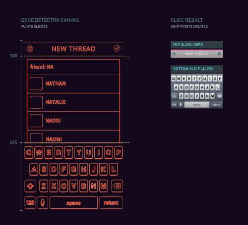
    It was important to us that slicers worked this way too. Since almost all fixed areas on iOS screens are headers or footers, we realized that we could just slice those parts off, and then fix them in place on top of the other content which would scroll underneath.

    The only input needed is the position of the slicer and of course we went to great lengths to make that task as easy as it can possibly be.

    Edge Detection

    Edge Detection

    Slicers use Flinto’s sophisticated edge-detection system that automatically detects 90% of title bars, tab bars, tool bars and keyboards on your screens. Just drag the slicer down, or double click, and it will snap right into position — it really could not be easier.

    Slice Several Screens

    Select multiple screens with matching fixed areas, and slice them all at once. Use command + a to select all screens, or shift + click to select a subset of all your screens.

    Magnifier and Fine-Grained Adjustment

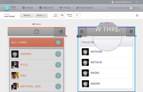
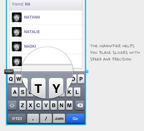
    In cases where your header or footer isn’t auto detected, you can use the magnifier to get pixel-perfect placement. Drag a slicer into the correct area, then use the arrow keys to move it into exact position. Use shift+arrow to move in 10px increments.

    Magnifier

    Building The Viewer

    Avoiding the Uncanny Valley of Scrolling

    You’ll notice the scrolling on Flinto prototypes is super smooth. We went to great lengths to use the iPhone’s built-in inertial scrolling instead of choppy and inaccurate simulated scrolling. We’ve seen far too many prototypes and web apps that use simulated scrolling that places them squarely inside the uncanny valley.

    Color Continuation

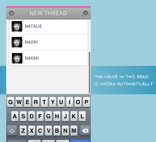
    When you introduce interial scrolling, it becomes possible to scroll past the top and bottom of a screen. So, what shows up in this area? It would be an easy enough problem to ignore. Just leave it as solid white, that should be good right? That’s not our style! We analyze the top and bottom row of pixels and pick a color to use which makes this transition much less abrupt.

    Color Continuation

    Try it and Tell Us

    Slicers are live now. Give it a try! If you haven’t signed up for Flinto yet, now’s a great time to start your 30 day free trial. We love hearing from you, so please get in touch and let us know what you think. Make sure to follow us on Twitter too.

    • Try Flinto
    • Share this on Twitter
    • Join our Facebook Group
    21 May 2013

    How Flinto Handles Screen Sizes

    Flinto resizes your screens to fit the width of the target device. If the height is taller than the device height, the screens will scroll.

    Read on for all the details.

    Note: I’m using the term “legacy” to mean non-retina, or @1x screen size.

    Screen Width

    Every screen added to a Flinto prototype will be proportionally scaled to fit horizontally. You don’t need to do anything special to achieve the results listed below, just upload the images you have and they will be presented in their best light!

    Retina screen on a Retina device: You’ll have a pixel-perfect representation of your screen graphics.

    Legacy screens on a legacy device: This will also produce a pixel-perfect representation.

    Retina screens on a legacy device: The screen will be scaled down exactly 50% to fit. Usually this works quite well, but you’ll probably want to design artwork for legacy devices when producing the graphics for your app.

    Legacy screens on a retina device: In this situation, screens will be scaled up to exactly twice their width to fit. This will produce the same result as viewing any legacy app on a retina device.

    Other screen sizes: Flinto is flexible. You can upload any size screens you want, and they will be resized to fit horizontally. Perfect for rough wireframes, photographs of sketches.

    Screen Height

    Flinto is flexible in this regard too. If you add tall screens, they scroll. If the screens fit exactly, they don’t. Keep in mind that Flinto prototypes show the iOS status bar, so for a perfect height screen, you’ll want to subtract 20pt (1pt is 1px on legacy devices and 2px on retina devices) from the device height.

    When we talk about the height of screens here, we’re talking about the proportional height after the width has been adjusted to fit the screen.

    Screen taller than device height: In this case, the screen will scroll.

    Screen shorter than device height: Here the screen won’t scroll.

    Screen shorter than device height: When this happens, there will be some empty space below the screen. This is usually undesirable, so make sure your screens are at least as tall as the device!

    iPhone 5 vs older iPhones: Flinto prototypes work on both 3.5″ and 4″ (iPhone 5) screens. Be aware that if you size your screens specifically for 4″ screens, they will scroll a bit on 3.5″ screens and if you size them for 3.5″ screens, they will have some empty space when viewed on a 4″ screen. Fortunately, that last case will become increasingly uncommon as time goes on.
    • Try Flinto
    • Share this on Twitter
    • Join our Facebook Group
    09 May 2013

    Two Weeks

    It’s been exactly two weeks since we launched Flinto, and the response has been awesome. Thanks to everyone who shared Flinto and given us feedback.

    Our post on Designer News helped spread the word and attracted some nice comments like these.

    “Wow, I was expecting to be sorely unimpressed by this, as I have been with past prototyping products for iPhone but damn, Flinto won me over.”
    — Shawn B.

    “I’ve been using this for the past month. There’s nothing better out there.”
    — Meng To

    There’s also been a lot of great feedback on Twitter, some of my favorites:

    “After a minute of testing I fell in love with @flinto - the best and fastest iOS prototyping tool I’ve seen so far.”
    — @tomreinert

    “Gotta say : @flinto is by far the best iPhone prototyping engine I have seen. flinto.com”
    — @shawnborsky

    “iOS prototyping for pimps: flinto.com | @flinto — errbody else just pick up yr ball and go home, no lie.”
    — @cpalmatier

    We’ve received many helpful bug reports and feature requests. Most of our time since launch keeping things operating smoothly. Kaz has been making lots of great behind the scenes changes to improve speed and stability.

    We’re getting started on some new features now, so keep an eye out for new cool stuff! We love hearing from you so feel free to contact us.

    • Try Flinto
    • Share this on Twitter
    • Join our Facebook Group
    25 April 2013

    Grand Opening

    We’re so thrilled to be launching Flinto publicly today! Anyone can join and start a 30 day trial. We encourage you to try making a prototype with Flinto, we really think it's the fastest way to do so.

    Don't have any screens? Try sketching out your app idea on paper, then photographing each screen. Flinto is flexible about screen sizes and you can replace them later with high fidelity designs.

    If you work at an agency, or on an iOS design team, check out our team option which allows collaboration on one set of prototypes among any number of members.

    Keep up to date with Flinto happenings by following this blog, our Twitter account, or Facebook page.

    • Try Flinto
    • Share this on Twitter
    • Join our Facebook Group
Previous Page Next Page
  • Blog
  • Pricing
  • Icon Strike
  • About & Contact
Use of this website constitutes acceptance of our User Agreement and Privacy Policy